 All of you who exlaimed, in response to my choice of book cover, 'but there's no TV in it' may well have missed promising careers in sales. That's precisely what the sales people at the publisher said. Thus, the search continues.
'Anonymous' reader was kind enough to send in a number of images with TVs in them. Sorting through that list, I've come up with a few possible candidates. And since this has been a joint project all along, I thought I'd solicit advice one last/more time.

What do you think any of these?


7 comments:
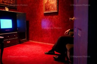
my favorite is the red velvet room with the viewer hidden behind the door. but there are 1000s more at getty images or magnum.
The black and white is probably my favorite of the group. I don’t love the dog (why is the dog there?), and the fact that the television has a title, but otherwise it’s great. The two people in bed could easily be two men – the gendering is subtle enough. I love the expression of the figure on television, and the fact that the POV is the couple viewing from bed – from within the private sphere of the bedroom from which television is able to be viewed queerly based on the “position” of the viewer in relation to social norms.
My second choice would be the color photo of the half-opened door. It says something like: “this is mysterious and suggestive!” – although of what, I’m not entirely sure. The orientation would be a problem though: by the time it fit on the cover (assuming it wouldn’t wrap around) it would be small and probably require one third of the cover to be a solid box with the text. I’m not sure if this is a good or bad thing, but it’s a consideration.
Dealing with a recalcitrant publisher and a cover myself right now, I offer this advice.
Determine if you are looking for a cover image that will take up on a portion of the front cover, or an image that will BE the entire cover. If the former, you don't need to worry too much about orientation. The publisher will make it fit and put some nice ugly color around it. If the latter, then you do need to think about orientation and dead space for putting the text on the front and back covers.
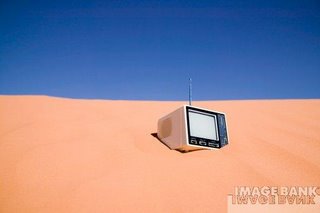
With this advice in mind, I suggest, contra the prevailing winds, the TV in the desert. The orientation is perfect for a full, wrap-around cover, front and back. The TV will end up on the bottom half of the front cover. The sky-line will act as an excellent boundary for putting text above in the sky, which, of course, will suggest the transcendent nature of your work. ;) The back cover will then have a nice abstract look with plenty of space for those blurbs saying just how lovely and insightful you are in this book.
I think also that the colors in the desert image will do a much better job of catching the eye of the book browser in the store. Black and white often just gets passed over. Too monochromatic, as in the two gallery images and the eye slides by.
I hope these comments are helpful, though I realize they are from such a crass, pragmatic point of view. But then again, I'm now a craftsman and no longer a theoretician.
I like the TV in bed one the best. Not only (to be practical) is it the right orientation, and thus wouldn't have to be cropped, but it does suggest the idea of sexuality, and get a nice time-warp effect (just spent an hour last night listening to Coontz talking about the way we never were).
Following up on Jack's comment (I was crass enough to not read what other people said before i jumped in), I agree with his point about colour. On the other hand, from my experience in the retail book business, I'd say having a good spine is probably more important than a catchy front cover -- and definitely more than a back cover. And I still think the B&W is interesting enough to get people's attention if you're lucky enough to have the book fronted.
I will note, however, that the TV in the desert is my second choice: I like it visually, but don't think it's as relatable to the topic.
And Dan? Why the dog? Well -- what's queerer than dogs in bed? After all, remembr the argument: if we allow gay marriage, next thing you know, people will be wanting to marry their dogs...
This is a bit off-topic on my own post, but I have to voice my support for Ruth's point about dogs in bed. To tell the truth, I'm not sure how single people without dogs stay warm.
i was going to say, the B&W was my close second choice, but reading jack's idea of a wrap-around, full cover with the TV in the desert, I agree that would be the most striking book, although (like Ruth) a little less directly tied into the topic.
Post a Comment